My Little
SCOPe
Brand Identity
Packaging Design
Marketing Collateral (OOH, Digital, POS)
Visual Strategy
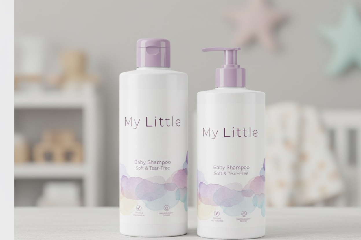
My Little sought a premium, gentle identity for their new line of baby care products, emphasizing trust and purity. We developed a distinct visual language to stand out in the category.
The core solution is a serene, watercolor Cloud Motif in soft pastels—lavender, aqua, and pink—paired with a clean, white background. This aesthetic establishes the brand as nurturing and high-quality, ensuring seamless application across product packaging and all marketing channels.
This unified design system was applied to the entire product family, from the Shampoo and Lotion (featuring claims like Dermatologist Tested and Tear-Free) to the Baby Wipes and various gift and shipping boxes. The packaging ensures key product benefits are clearly visible while the consistent lavender accent color on caps and pumps reinforces the brand's premium, thoughtful approach across all formats.
The accompanying marketing collateral translates the feeling of gentle care into broad appeal. The out-of-home (OOH) billboards use high-impact, emotional lifestyle photography to quickly build trust with a wide audience. Meanwhile, the in-store Point-of-Sale (POS) displays leverage the full watercolor pattern to create a recognizable, comforting destination within the retail environment, driving impulse and initial purchases..