Culloden A Coastal Estate
Culloden A Coastal Estate
Luxury Estate Branding for Dual-Use Living
SCOPE
Core Capabilities
Brand Architecture & Dual-Brand System
Estate Master Planning & Entrance Design
Digital Platform (Booking + Resident Portal)
Villa Sub-Brand Development
Environmental Design & Signage
Visualization & Development
AI-Assisted Architectural Rendering
Spatial Experience Design
Brand System Prototyping
Hospitality Journey Mapping
DELIVERABLES
Dual-brand architecture strategy
Visual identity systems (estate + hospitality)
Villa sub-brand framework
Estate entrance redesign (architectural plans + renders)
Reception house concept
Digital platform (website, booking system, resident portal, mobile app)
Brand guidelines
Marketing strategy + launch campaign
Overview
Culloden is a luxury coastal estate in Jamaica a gated community of 30+ villas where owners live full-time, retire, or operate their properties as high-end vacation rentals.
The challenge: Create a brand system that honors resident privacy while enabling villa owners to compete in the luxury hospitality market.
We designed a dual-brand architecture: one identity for the estate (community, belonging, discretion) and one for hospitality (visibility, bookings, guest experience) unified by visual language but distinct in purpose.
The Problem
Caribbean luxury real estate operates in extremes.
Traditional estates prioritize resident exclusivity but villa owners struggle to market rental properties without estate-level branding. Resort developments offer branded hospitality but sacrifice the privacy and autonomy that buyers want.
Culloden sat between both worlds and had neither:
No unified estate identity
No hospitality presence or booking platform
No distinction between residents and rental operators
Dated entrance experience that didn't reflect property values (£1.5-3M per villa)
No digital infrastructure for either community or guests
The estate had 20+ years of history and ocean views but no language to express itself.
The Approach
We split Culloden into two brands operating as one system:
CULLODEN — The Estate
For full-time residents and long-term owners.
Positioning: Private, timeless, rooted in community and Jamaican heritage.
Tone: Quiet dignity. Belonging without exclusivity.
CULLODEN BY THE SEA — The Hospitality Brand
For rental properties and guest experiences.
Positioning: Coastal luxury hospitality — villa-level privacy, resort-level service.
Tone: Warm, inviting, aspirational. Destination-focused.
This structure gave each stakeholder what they needed:
Residents maintain estate prestige and privacy
Villa owners gain hospitality visibility and booking infrastructure
Guests experience curated luxury (not generic Airbnb)


Brand & Touchpoints
The estate had an existing anchor symbol — heritage, but underutilized.
We refined it: cleaner lines, balanced proportions, confident without being corporate.
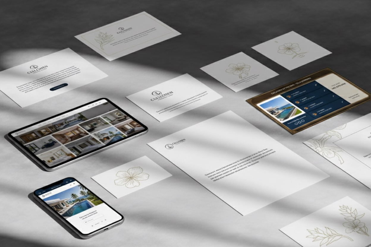
Visual Identity
Resident-facing:
Debossed stationery (cream stock, subtle anchor emboss)
Estate signage (stone monuments, palm-lined entrance)
Security credentials (magnetic cards, vehicle passes)
Community communications
Hospitality-facing:
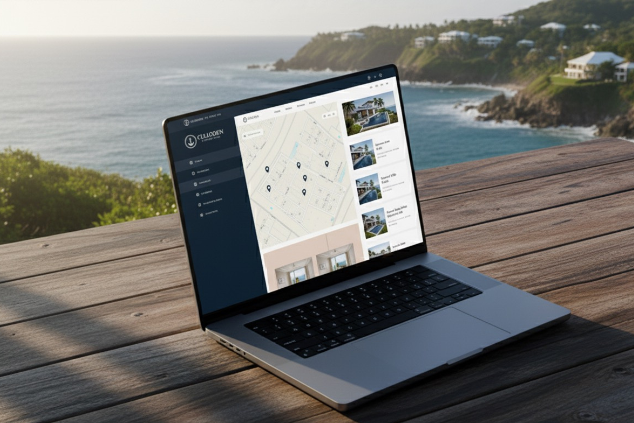
Website + booking platform (Culloden by the Sea)
Villa sub-brands (each property gets individual identity)
Guest collateral (welcome guides, concierge cards)
Social media (Instagram-led destination marketing)
Design principles:
Minimal but warm (not cold minimalism)
Natural materials (stone, wood, palm, ocean)
Typography: Serif for estate (timeless), sans-serif for hospitality (modern)
The brand doesn't compete with the view — it frames it.


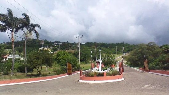
THE GATEWAY & ARRIVAL EXPERIENCE
The entrance was the estate's first impression — and it felt dated.
We redesigned it as a landmark:
Physical Interventions
Palm-lined approach: Double rows of royal palms creating ceremonial arrival
Anchor monument: Stone-set anchor symbol at entry (brand as architecture)
Security pavilion redesign: Contemporary structure replacing dated guard booth
Layered landscaping: Native plants, lighting, spatial definition
Reception house: New structure where residents + guests check in before reaching villas
Spatial strategy:
Create layers of arrival each building the experience. By the time guests reach their villa, they've already felt the estate's character.


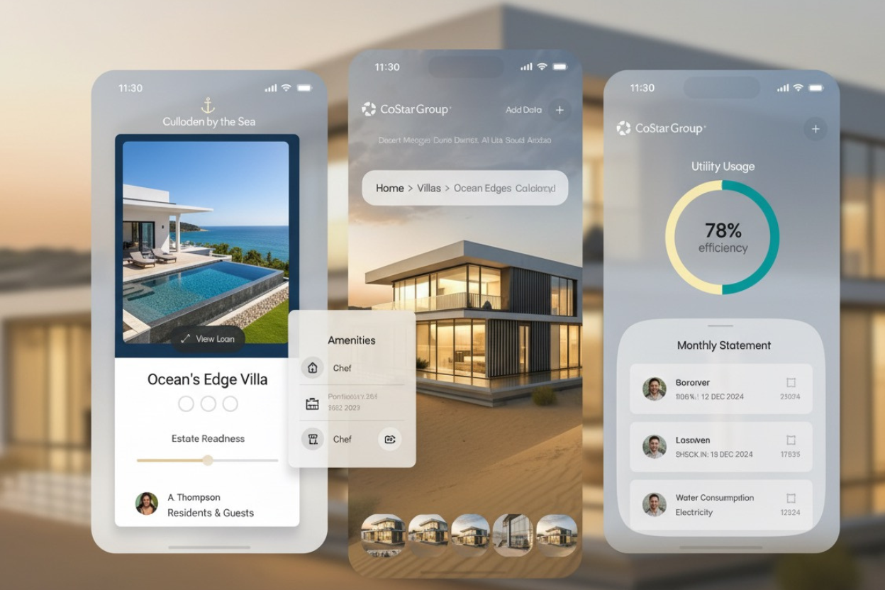
Digital Product
One platform. Two user types.
For Residents & Long-Term Owners:
Property management dashboard
Maintenance requests
Estate updates & communications
Community calendar
Security notifications
Amenity booking
For Guests & Rental Properties:
Villa discovery + booking engine
Individual villa profiles
Concierge requests
Estate navigation
Smart check-in
Local recommendations
For Villa Owners (Rental Operators):
Listing management
Booking calendar integration
Guest communications
Revenue reporting
Maintenance coordination
Design philosophy:
The app mirrors the environment: calm, intuitive, uncluttered. Navigation is spatial (think: walking the estate) not hierarchical (corporate menu systems).