Caelum Residences
Caelum Residences
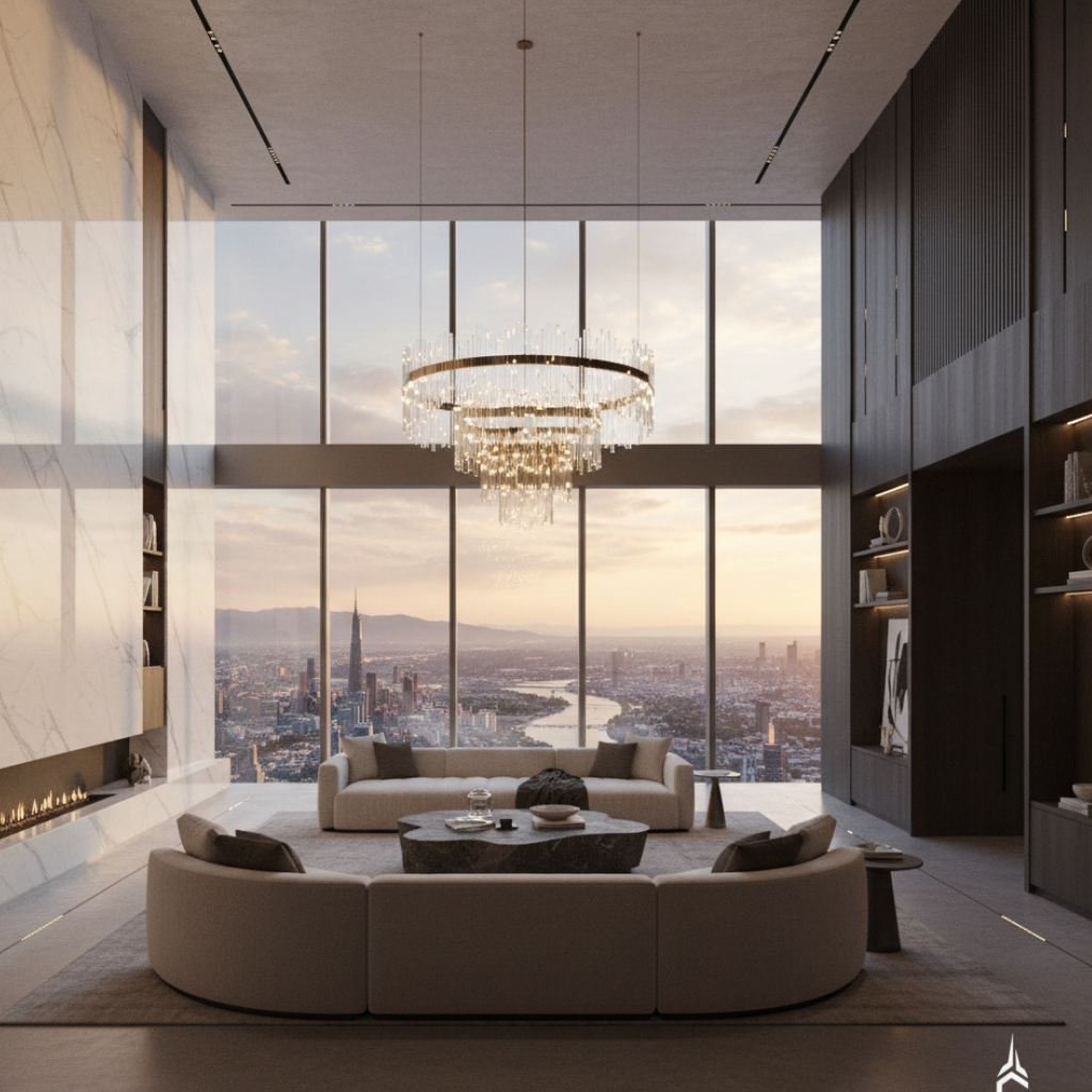
Luxury living elevated above the skyline
SCOPE
Brand Identity
Brand Collateral & Stationery
Marketing Materials
Visual Strategy
Overview
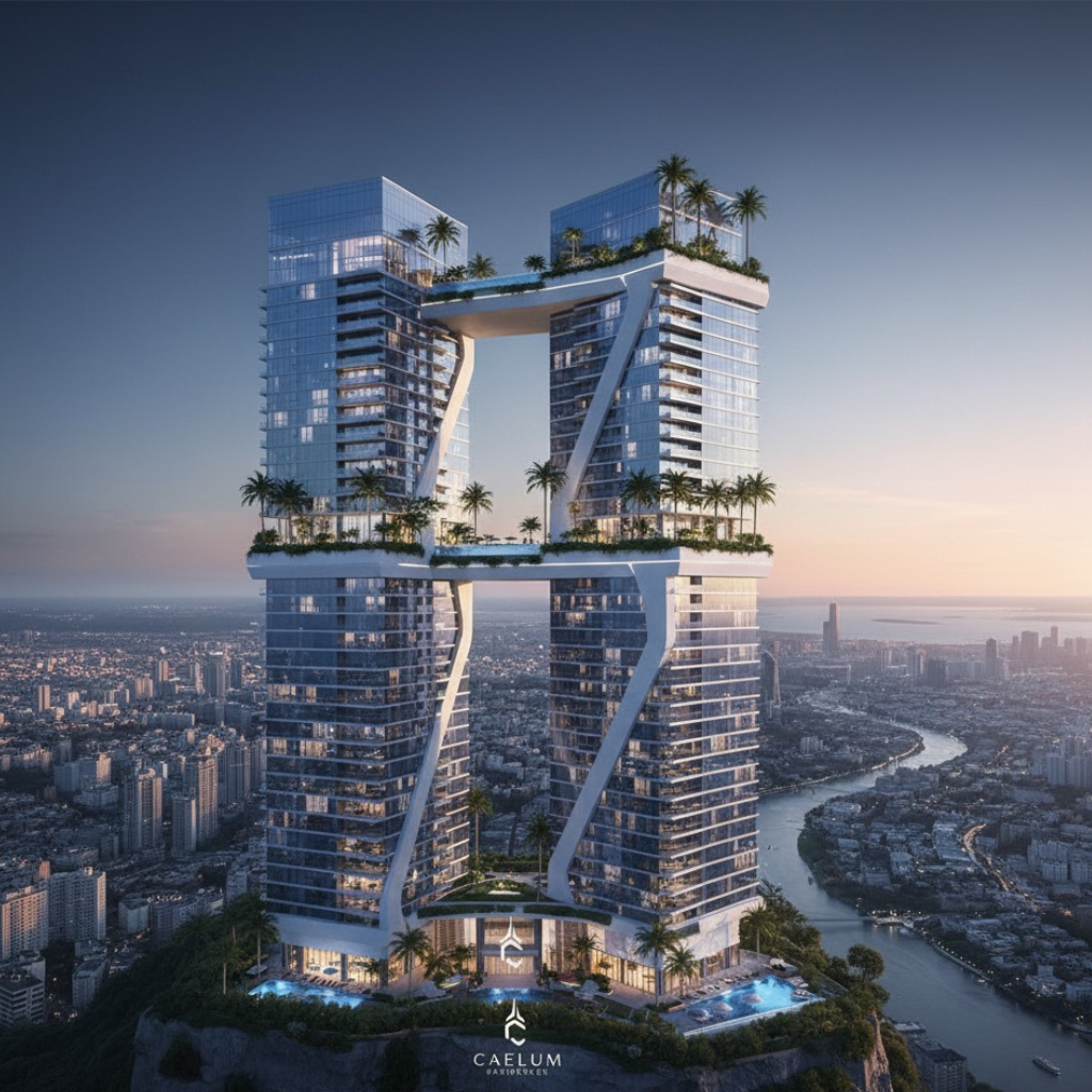
Caelum Latin for "sky" is an ultra-luxury residential tower. The brief: create a brand identity that matches the architectural ambition and reflects the elevation, both literal and aspirational.
We designed the identity, collateral, and visual language. The architecture speaks first. The brand amplifies it.
The Problem
Most luxury residential brands look expensive but feel interchangeable. Serif fonts, gold foils, marble textures.
The Approach
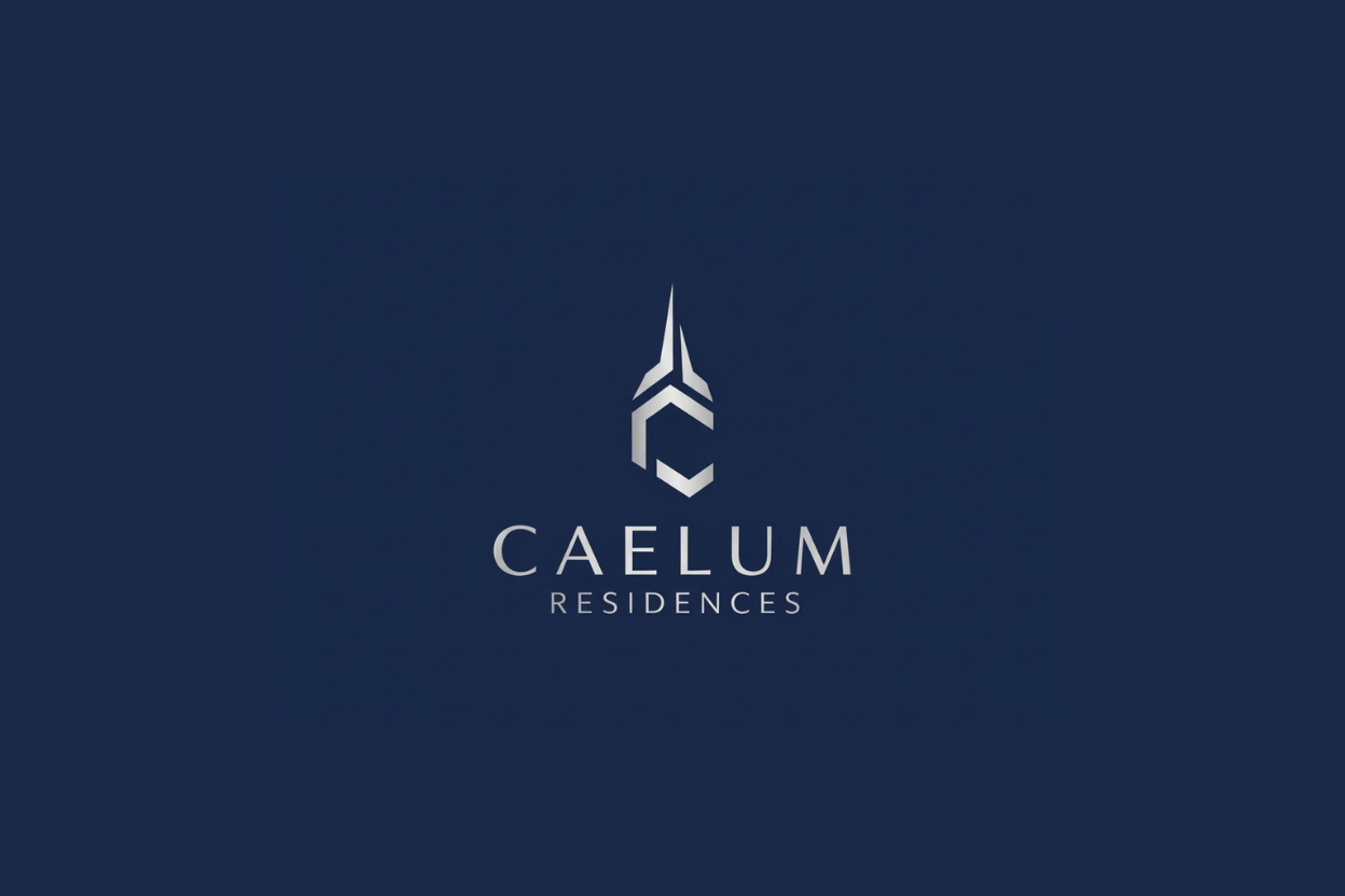
The logo is geometric and architectural a stylized tower form echoing the building's vertical strength and sky bridge connections. Engineered, deliberate, modern.
Color palette: Deep navy and silver-white. Calm, elevated, timeless.
Typography: Clean, contemporary sans-serif. No script fonts. No unnecessary flourish.
Brand Identity
The logomark combines vertical lines and angular geometry — a visual nod to the twin-tower structure and connecting sky bridges. It reads as both a building silhouette and an upward arrow.
Strong without being aggressive. Luxury without being loud.
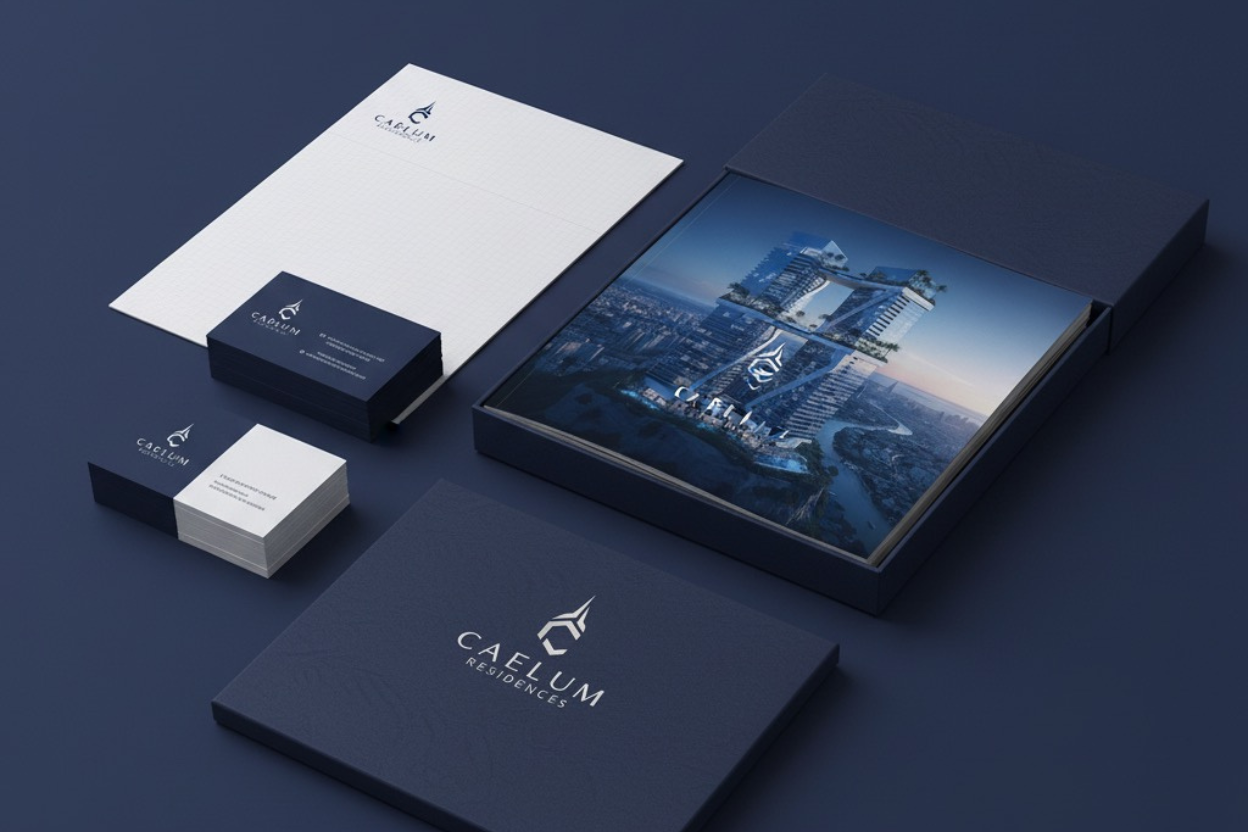
Collateral
Debossed business cards on navy stock. Embossed stationery with metallic accents. Marketing brochures that prioritize photography over text — the building sells itself.
Every piece designed to feel premium but understated. Confident enough to use white space.
Outcome
A brand that matches the architecture's boldness without overshadowing it. Contemporary, structured, premium.
Caelum doesn't announce itself. It rises above the noise.
Brand & Creative Direction: MA Studio
Imagery: Architectural visualization
Sector: Luxury Residential Development